Comprehensive LMS Dashboard
Compliance and Progress Tracking for Enterprise Learning
OVERVIEW
The LMS Dashboard is Paycom’s centralized hub for monitoring employee learning, managing training content, and tracking compliance across large-scale programs. The previous dashboard was fragmented and overly static, making it difficult for administrators to monitor progress, spot compliance risks, and take action quickly. These gaps created inefficiencies for teams that needed real-time visibility and dependable oversight.
MY ROLE
As the lead designer on this project, I guided the end-to-end redesign of the LMS Dashboard—working closely with product and engineering from research through delivery. My focus was on unifying fragmented views, surfacing the most critical insights, and shaping intuitive workflows that streamline monitoring and strengthen compliance management at scale.
MY ROLE
Lead Designer
SKILLS
User Research Information Architecture Wireframing & Prototyping High-Fidelity Wireframing
TEAM
Product Manager
UX Team Lead
Engineering Team
TIMELINE
July 2024 - March 2025
OVERVIEW
Why a Redesign Was Needed
The original LMS Dashboard wasn’t built for enterprise-level training programs. Key information was spread across static, disconnected views, making it hard for administrators to monitor progress, identify risks, and take action quickly. As training demands scaled, these gaps created inefficiencies and made reliable oversight difficult—necessitating a redesign to unify insights and support real-time compliance management.
CHALLENGES
FRAGMENTED DASHBOARDS, FRAGMENTED EXPERIENCE
The system was built for small teams, not enterprise scale. Critical information was scattered across disjointed views, forcing supervisors to hunt, backtrack, and piece together insights that should’ve been visible at a glance.
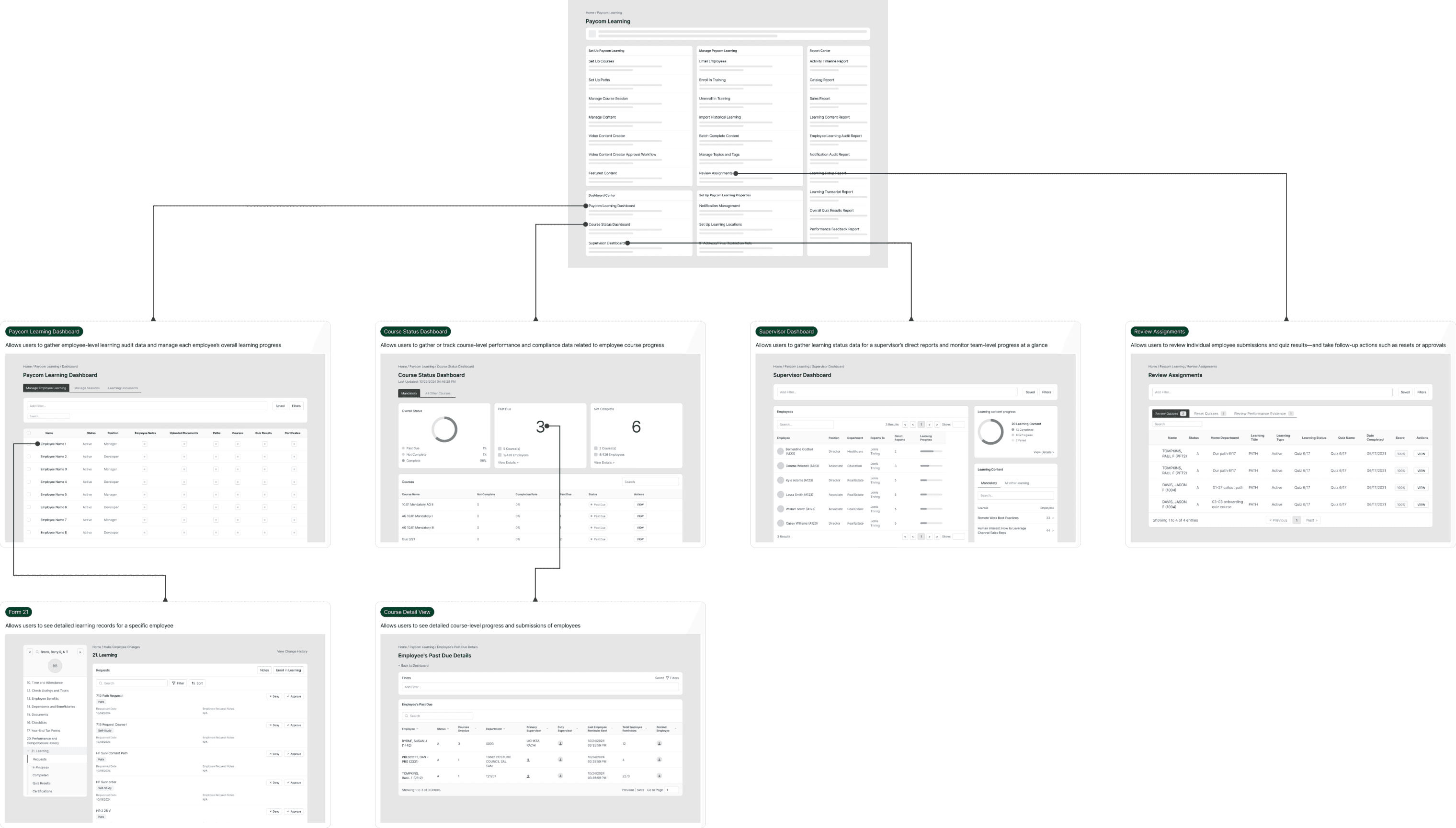
Current state workflow for session creation and roster management
SUCCESS METRICS
target Outcome
The redesigned dashboard consolidates assignment reviews, progress tracking, reminders, and reporting into a single, contextual hub to reduce fragmentation and streamline oversight. These benchmarks will be used to measure its impact once adoption grows, focusing on navigation efficiency, task completion, and administrator confidence.

RESEARCH
UNCOVERING FRICTION IN A FRAGMENTED SYSTEM
To better understand the impact of dashboard fragmentation, I conducted a comprehensive analysis of how users navigated between the four separate dashboards. I audited 20+ workflows, analyzed navigation patterns, and reviewed support tickets to identify where the multi-dashboard system was creating the most friction.
KEY FINDINGS
By analyzing the current experience through existing system audit and support ticket review, I identified three critical pain points affecting administrator efficiency:
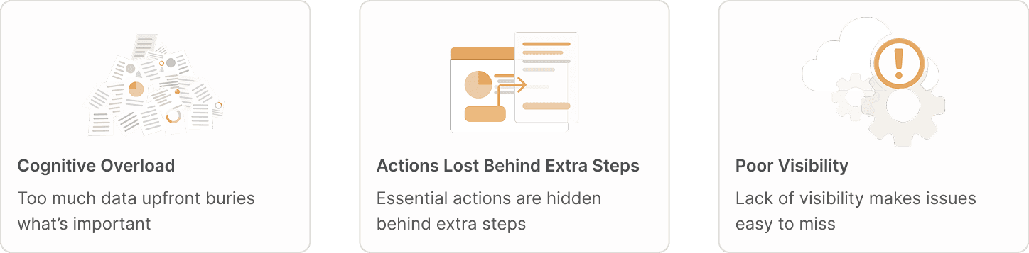
These findings revealed that administrators were juggling multiple disconnected dashboards, each providing partial context but never the full picture. To resolve this, there was a clear need for a unified, real-time dashboard that consolidates insights across systems, minimizes unnecessary steps, and helps users focus on what truly matters. This led to the guiding question:
How might we design a unified, real-time dashboard that consolidates critical insights and empowers administrators to act confidently without cognitive overload?
THE APPROACH
BUILDING A UNIFIED DASHBOARD
This strategy centered on three design principles that guided every design decision:

The design principles guided my approach to unifying the dashboard experience. Instead of improving isolated screens, I reorganized information and actions to reduce cognitive load and support the way administrators naturally work. These principles were reinforced through early validation sessions, where feedback on clarity and inline actions directly shaped the final direction.
SOLUTION
FROM INSIGHTS TO STRATEGY
Building on the need to consolidate four separate dashboards into a unified experience, I designed targeted solutions that bring all learning-related information into a single, intuitive interface—while preserving the unique functionality of each original dashboard. This approach resulted in three core features that fundamentally change how administrators access and act on learning data:

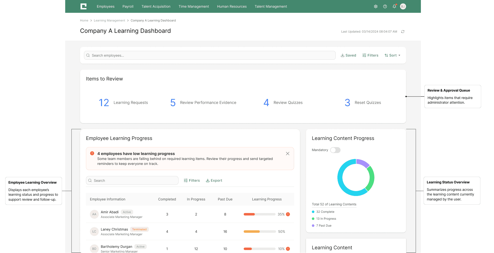
DYNAMIC TEAM MANAGEMENT
Empower supervisors with a centralized dashboard that offers real-time team insights. Smart filtering automatically surfaces relevant employee groups, while customizable views allow for quick monitoring of performance, compliance, and overall team well-being.

PROACTIVE LEARNER SUPPORT
A streamlined interface for proactive learner support. Supervisors can review individual progress and, with a single click, send targeted reminders for specific courses to ensure timely completion.

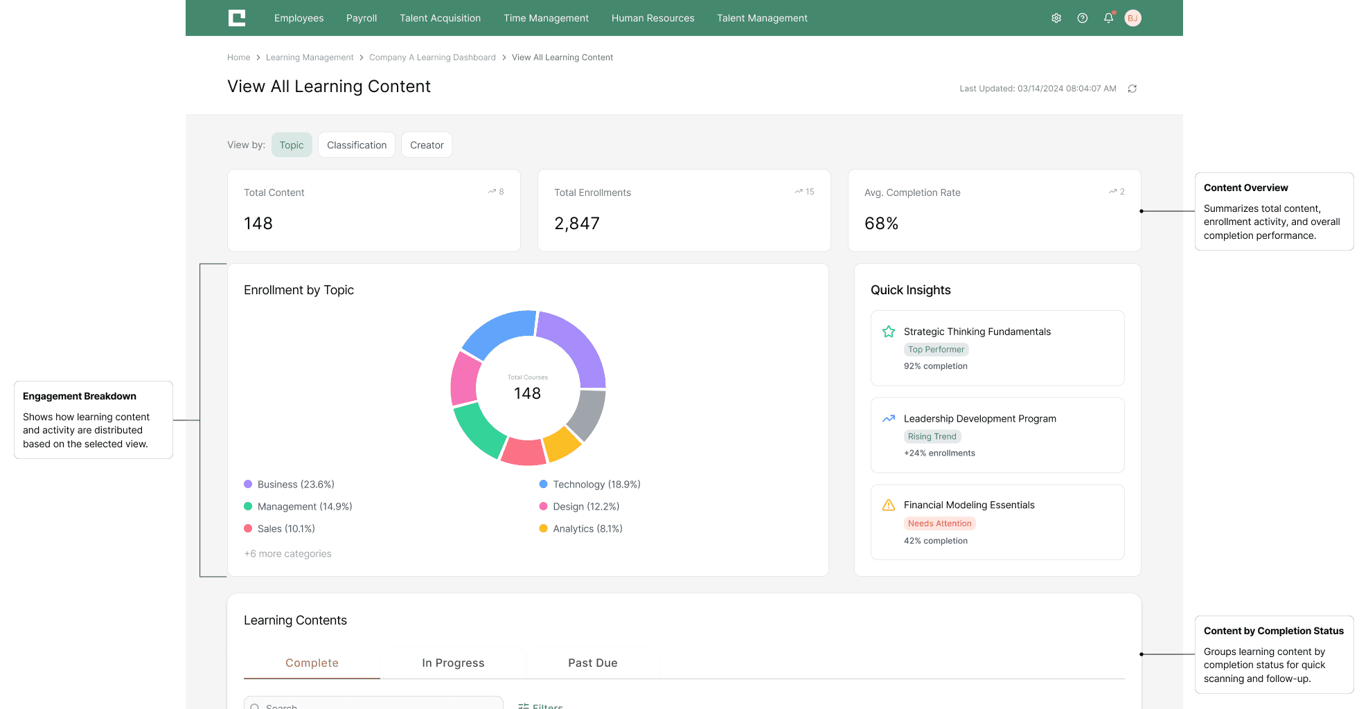
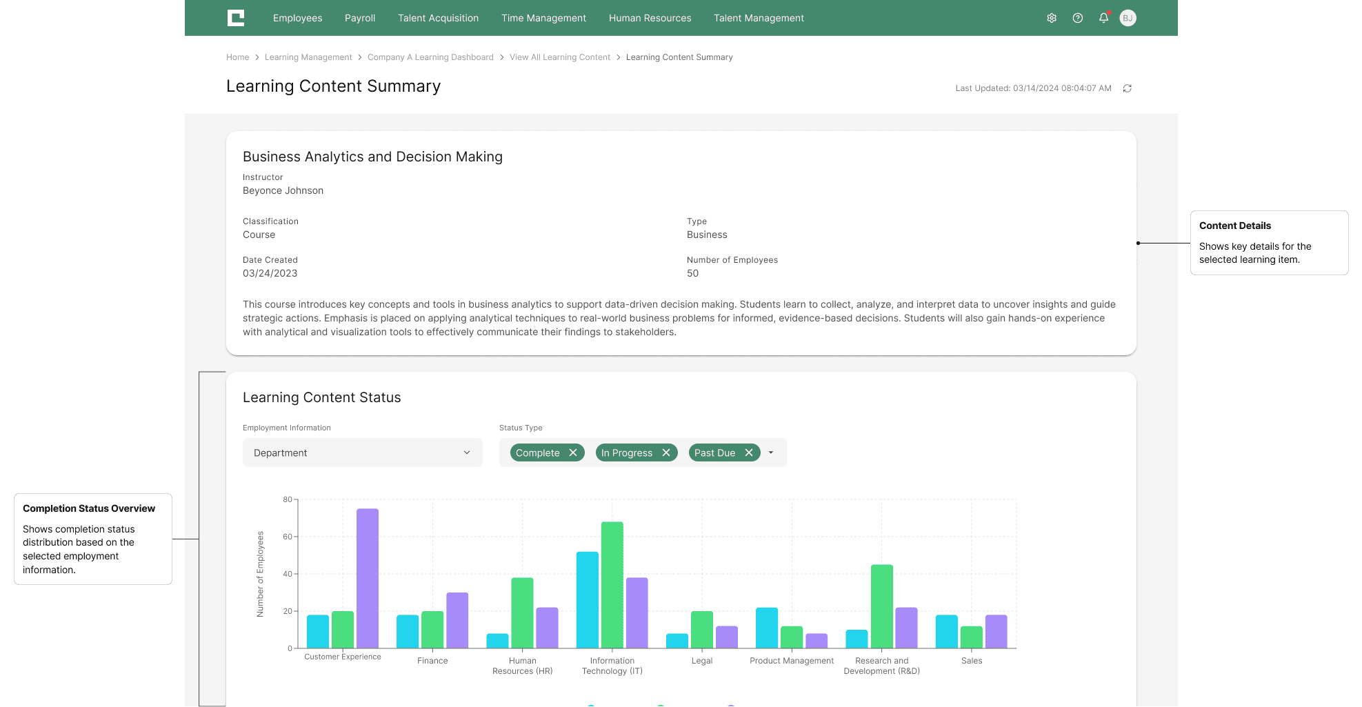
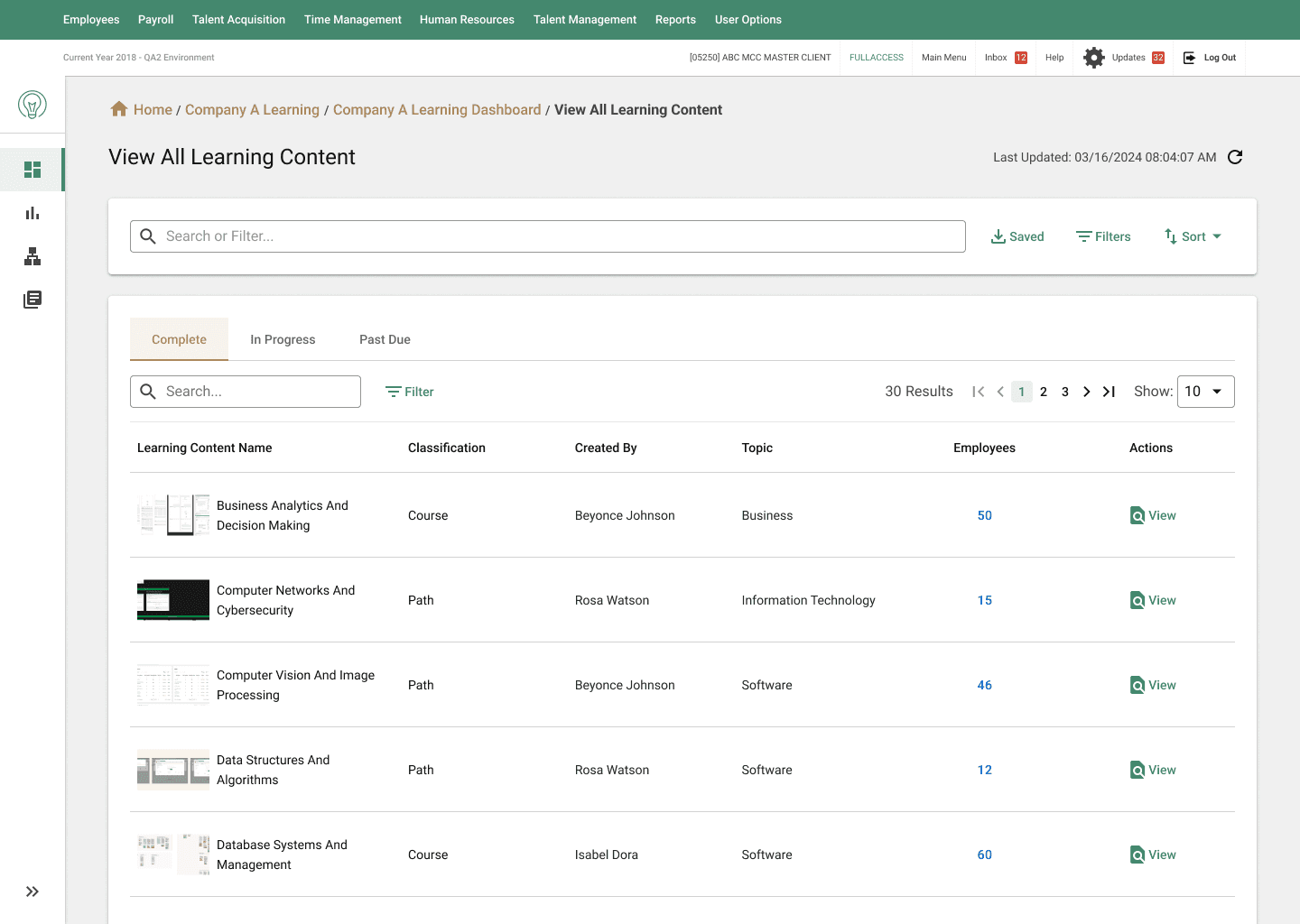
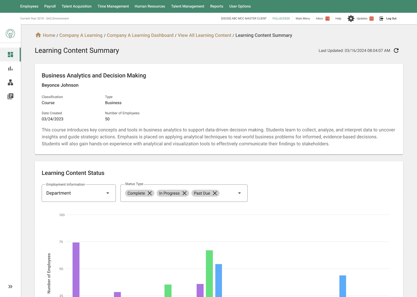
CONTENT-SPECIFIC PROGRESS TRACKING
Instantly track the progress of a single training module across an entire team. Clear data visualizations highlight completion status and help supervisors track compliance and identify bottlenecks at a glance.
DELIVERABLES
FINAL OUTCOME
The redesigned LMS Dashboard has been fully documented and handed off to engineering, with implementation currently underway. The updated layout, information hierarchy, and interaction patterns are being integrated into the LMS in phases to support a stable and incremental rollout. As development progresses, the dashboard will continue to evolve through real-world administrative use and iterative refinement.
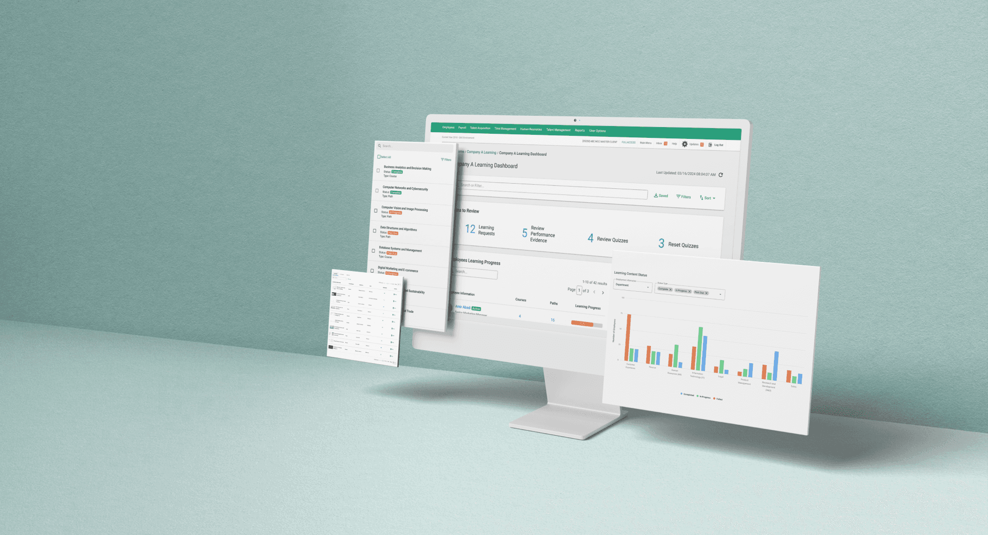
SEE THE REDESIGNED EXPERIENCE IN ACTION
Below are the final high-fidelity interfaces representing the completed redesign.

USER FEEDBACK
Early stakeholder reviews indicated improved clarity in navigation and stronger confidence in understanding overall learning status. Reviewers noted that key information was easier to scan and interpret without moving between multiple views.
Full administrator rollout is currently in progress. Qualitative feedback and quantitative metrics will be collected post-launch to assess usability and inform future refinements.
*.·:·.✧ ✦ ✧.·:·.*